I’ve been responsible for the UX and overall Product Design of several web applications that all faced the same issue: In order to improve our machine learning model, we need our users to label information and correct the ML’s output. How do we entice our users to label information in order to train our machine learning models within the user flow without making it feel like work? How do we balance the ML’s initially minimal output with getting users to manually label data?
I’ve seen this design problem with use cases varying from property management analytics dashboard, to a chatbot analytics dashboard, and most recently with a resume formatting tool for recruiters. This blog post will be a case study of the full design process for a resume formatting tool with a focus on the ML labeling design later in the process.
Background
This client came to me with an existing web application targeted towards agency recruiters and their support teams. The problem being solved by this web app is that recruiters need to reformat candidates’ resumes all into the same agency-branded template, and sometimes remove any of the candidate’s identifiable information. The status quo of how this is currently done is manually, with a lot of copy-paste from the candidate’s original resume over to the agency’s branded resume template and front-sheet template. Turns out that’s why recruiters who message you on LinkedIn also ask you to type up your resume in a docx format (am I the only one who thought that was weird and annoying?)
As part of the questions that I asked the client, I discovered that their fully functional existing web application only had users who were friends and family, none of which were active users. Forms of marketing had not been fruitful. As such, I identified the core problems as a lack of user retention, user engagement and therefore a low percentage of users training the ML models.
Creative Process
I communicated to the client that the approach I take will involve doing a redesign without any constraints to the development, but then will be followed with reeling back the designs to iterate on their existing designs with a focus on what dev work will have the highest impact. As a part of this process, I also emphasized that I won’t be looking at their existing designs until a later point, as I didn’t want it to limit or create a bias in my creative thinking.
As this was a specialized B2B use case that I fully didn’t understand, since I’ve never worked as a recruiter, I started with User Interviews as a means to gain a deep understanding of the problem the web app is trying to solve and to understand the motivations and goals of the target users.
User Interviews
The client, who was previously a recruiter and understood the market, naturally seemed confident that most recruiters think as he does and formats resumes like he does. I wanted to see the status quo of how users are solving the problem that the client was trying to automate. I’ve found that with User Discovery Interviews, there is diminishing returns in terms of new information gained after about the 5th interview from the same user segment. Below I’ve included the user interview questions that I asked on the Zoom calls.
User Interview Questions and Why
I’d like to understand your work-flow of a recruiter’s resume editing process. I will be asking you some questions and watching you perform some work on screen-share. For the questions I ask, I’m looking to understand your perspectives based on your personal experiences in the industry.
Can you show me a typical end to end work-flow of what you do with 1 job candidate, from receiving the email up until you submit it to a client? When you do this, can you please think out loud and narrate what you’re doing, I might interrupt with some questions. [Why? Trying to observe the tasks that may be overlooked or under-reported by the recruiter because they’re so used to it. Observing for key points of frustration or boredom communicated by human error or changes in their tone, rather than words. Digging deeper with questions about why they did certain things the way they did, and questions to lead to what’s important to them.]
What is the most frustrating part of this process? [Why? Trying to see if what they verbalize as the most frustrating part matches my observation from the previous steps, as it will reveal the deepest pain point]
Are there some parts of this process that you made up yourself, perhaps short cuts, or something to be more efficient? [Why? Usually, if there are any such “hacks”, it makes for a good product feature or selling point.]
What do you enjoy most about this process? [Why? This is generally what motivates them to do their job and reveals their motivation, further allowing design centered thinking.]
What is your biggest hurdle in achieving success in this process? [Why? This is a higher level question when compared to #2 and allows for further design centered thinking like #4. Success in this context is important to talk about since their status quo process is just a means to that end.]
What is your title, and responsibilities? [Why? To see if there are any correlations amongst such demographic data and insights found unique to each interview.]
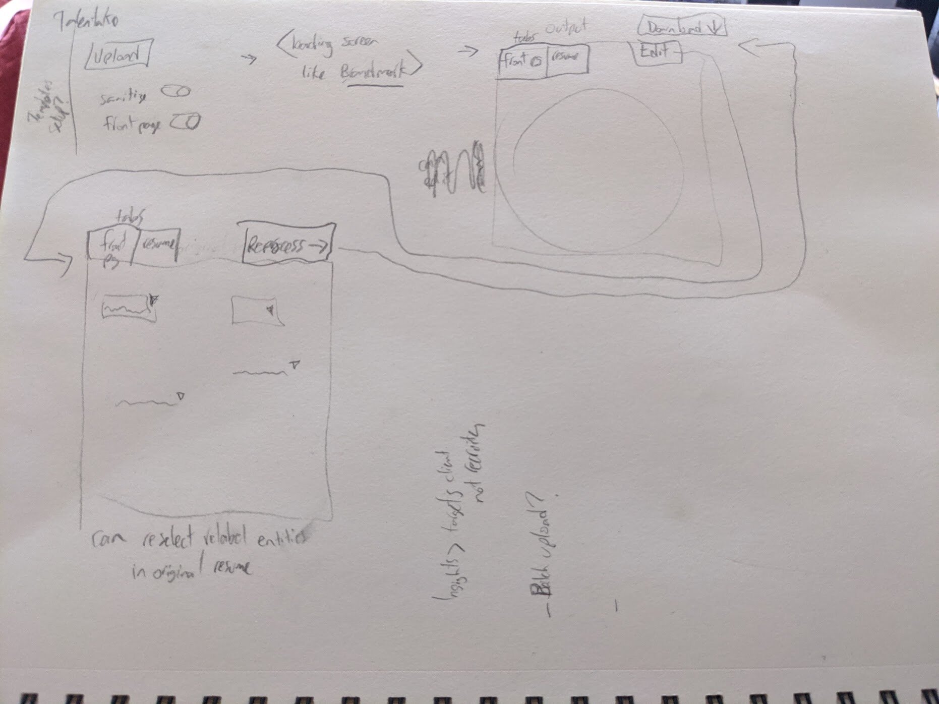
Initial Sketches
Based on watching these users show me their process and express their motivations I started sketching all of my ideas on how it could be better done within the confounds of a web application. It was particularly important to get these ideas out of my mind before moving on to the next step, where for the first time I look at the user’s current design and user flow. These designs were never sent to the client, they were for me to reference at a later point (hence the rough presentation).
UX Audit
I have written extensively about my UX Audit process on this third party blog, so I won’t get into too many details in this post.
Since the problem was identified as user retention and engagement, without which the ML will be completely useless, I focused on a new user’s experience uploading their first resume, making corrections and downloading the ML output in the form of a reformatted resume (the happy path).
I approached it as if I was doing a user test on myself and annotated all of the parts of the process, considering important UX heuristics.
Here is a small set of the issues I pointed out in the UX audit:

Redesign
By going through the process as it was originally designed, I found myself constantly running into the question of “What do I do next?”. To fix this problem, part of the redesign required improving the user onboarding and navigation structure by fixing the visual hierarchy and limiting the choices the user has. A great analogy for this part is Turbotax. Step-by-step, drawing attention to things displayed when the user needs them. As a part of this, I proposed a very simple 3 step process: Upload > Edit Labels > Preview and download.

Machine Learning UX
The important part of designing a way for the users to correct ML output, and label data from scratch, is designing for the edge cases and finding a happy medium. After speaking with the team’s deep learning AI specialist (the ML guy), I identified the following to design for:
-ML model labels nothing and the user needs to label everything
-ML model labels a few things and the user needs to label everything else
-ML model labels everything and the user needs to check them and make corrections
As a part of my newly proposed 3 step navigation structure, this would all be in the Edit Labels section. As a part of this section, a great analogy to communicate my thinking process was Duolingo’s interface. After a user creates their first label, gamification and positive reinforcement would be extremely important to encourage the user to create subsequent labels.

As a part of it, a user should not be able to see a rough bare-bones template output (as was the case in the designs at the time) and instead, would need to label a certain amount before ‘unlocking’ a more satisfying, complete looking output. Of course, as time went on and the ML model got better, they would automatically see good outputs. But in order to get there, the designs must first incentivize users to make labels.
I identified that the mechanism of the ML labeling interface would need to communicate the following:
-what things were labelled by ML
-what to label (I.E. first name)
-how to label something
-how to correct a label (I.E. last name was labelled as first name)
-how to correct the highlighted text (I.E. Arvand Alviri is labelled as first name, but the user should be able to change the highlight to be only Arvand, instead of removing the label and re-highlighting it from scratch)
-how to remove a label

Final Steps: User Analytics to Correct Machine Learning Models
For the final steps, I gave the client a user analytics tracking plan, that would help them make future product decisions, as well as gather extra data for the ML model. Things that I suggested they track in their user analytics tool included:
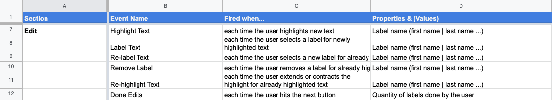
As an example, these two would help identify which labels are most commonly missed by the ML, and which are most commonly mislabeled by the ML.
Other user analytics events that focused on user retention and engagement over the overall product as well.
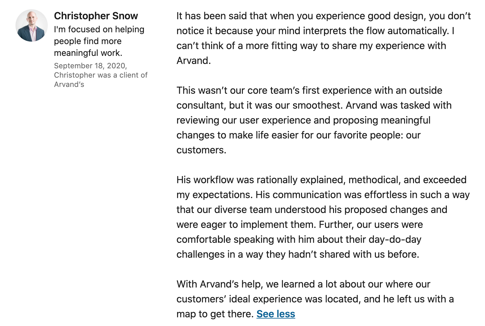
Client LinkedIn recommedation