"Really great UX/UI consultant. He did outstanding work for us. We will definitely use Arvand again and can recommend him highly." -Kristian, Technical Lead of Build
Defining the Minimum Viable Product
The client approached me wanting a brand new B2B analytics application designed. I asked the client extensive questions to discover that the business goal of the designs is to communicate and sell their product idea to onboard potential users, as well as investors through presentations. The client had written out several documents with product specs that specified the product features that they wanted. I asked the client hard hitting questions to discover the true underlying purpose of the application, what problems it's meant to solve, the user acquisition strategy, the user retention strategy and so forth, in order to truly be able to break down the list into must-have's, and nice-to-have's. Breaking down the list as such, allowed me to define the Minimum Viable Product, while keeping in mind that some additional features need to be designed for presentation purposes... since the ultimate goal is to sell the idea to investors and potential users. I worked with the product specs document they had written, but questioned, and criticized the features that did not make sense to me from a usability and product strategy perspective. Through this process, the client and I reached a final list of features that we agreed should be in included in the designs, which revealed 3 user types.

Designing Mobile First
Each user type had a separate goal, and use case. I determined what device each user would be using, and designed each user type's UI appropriately on that device, while considering any technical limitations. I first designed for the user type where most of the UI elements would be carried over to the other 2 user types. I designed this mobile first since once the time comes to convert the design to other screen sizes, it's relatively simple to add elements (on bigger devices), but it's extremely difficult to subtract them.

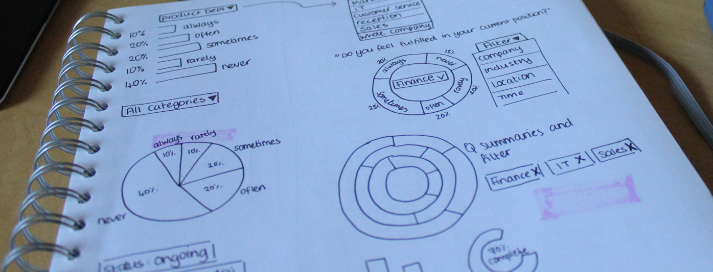
Brainstorming UX/UI Designs for Displaying Data and Analytics
When designing mobile first, I always sketch pen to paper first, since this way I can go through many variations in a short period of time before committing designs to a computer program and in this case it was no different. I tackled what I perceived to be the most complicated UI problem to solve in this app... how to present analytics data. To do this, I had to create a deep empathy with the user by really immersing myself in their headspace by learning about what problems this data would be solving, what specific question they would be trying to answer with this data, and what tools they are using now to address these problems. Some of this was achieved through research, some by talking to the client, and some by speaking with individuals who fit the user persona.
One key tactic I used in order to break down this complicated data into analytics graphs that were intuitive to the user, was to break down the data into how it would be read in simple English, for example: "Department X overwhelmingly responded 'always', Department Y mostly responded 'never'." Some of these got more complicated, since some use cases required datasets to be compared to each other. For these, I used the same tactic, by breaking down the problem that the user is aiming to solve, the question the user is aiming to answer, and how the user would read the data in simple English.
Designing the App's User Flow Wireframes
Once I was happy with the various methods of laying out the analytics, I proceeded to designing the mobile application's information architecture and overall user flow. I quickly did this on paper since by this point I had a really good idea of how it would look.
At this stage I had all the core UI that I needed to move onto the computer. My tool of choice is Bohemian Sketch. I converted the analytics UI, as well as the basic user flow into the wireframes for the mobile device. This went through several iterations with the client, as expected. Some things that came up out of discussing the wireframes were new use cases, as well as edge cases that should be addressed. These edge cases and some of the new use cases were integrated into the wireframes. I also designed the additional features that the 2nd user types would see and experience on mobile.

Converting Mobile UI to Desktop UI
Once we were happy with the mobile designs, I moved onto the desktop use cases, and desktop user types. This was essentially converting the mobile designs into desktop, and including additional information, with a couple of additional use cases. This was an iterative process of playing around with grids and layouts until it made sense for desktop, and made sense for the user's goals. Special attention had to be paid to the hierarchy of information, since the user has a specific goal in mind in this use case and a lot of data to look at on a big screen. I went through several iterations of this with the client before we had covered all edge cases and we were both happy with the designs. I went through the same process with the 3rd user type for desktop.

Prototyping the Mobile Analytics Interaction Design
I created a mobile prototype using InVision to make sure that the interaction design of the most complicated UI elements were intuitive. This prototyping exercise led to discovering a few potential interaction sticking points that might not be obvious to the user. These issues were addressed, and re-prototyped. You can see the final mobile InVision prototype here.
https://invis.io/ZK96J2A85
Analytics Visual Designs
The last step was making it all look beautiful. I asked the client about the emotions and perceptions they aimed to evoke in users, as well as some applications they find inspiring, unfortunately they had none, which pushed me to play around with a variety of different hues, saturations, and color combinations. This iterative process resulted in the final designs seen below.
